Showing posts with label graphic. Show all posts

Monday, 5 October 2009

Periodic Desktop of the Elements

Periodic Desktop of the Elements

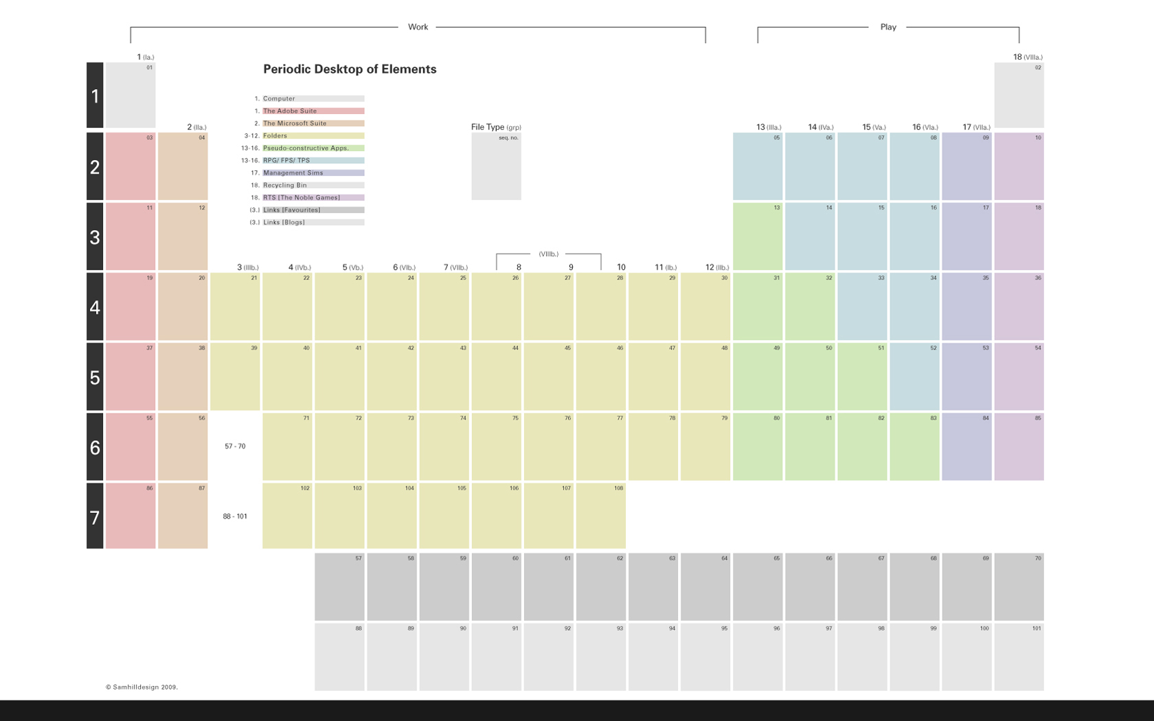
The Periodic Desktop is a back-burner project I've had on the go for a while, and it's evolved a fair bit as I've lived with it - grouping, positioning and coding my most frequently used programs in various ways.

I use my desktop PC* as a work-station and an entertainment centre, occasionally the latter when it should be the former. I've borrowed the metal/non-metal parameters from Mendeleyev's Periodic Table and tried to use the asymmetric distribution to create a digital space that encourages work over play.

I've also setup direct links to my most frequented sites and favourite blogs (Dezeen, BoingBoing, It's Nice That et al) in place of the Lanthanide and Actinide series.

Unfortunately the above .jpeg will only work properly on a Vista 1680 x 1050 px display, but if anyone expresses an interest I may adapt it for other resolutions or operating systems.

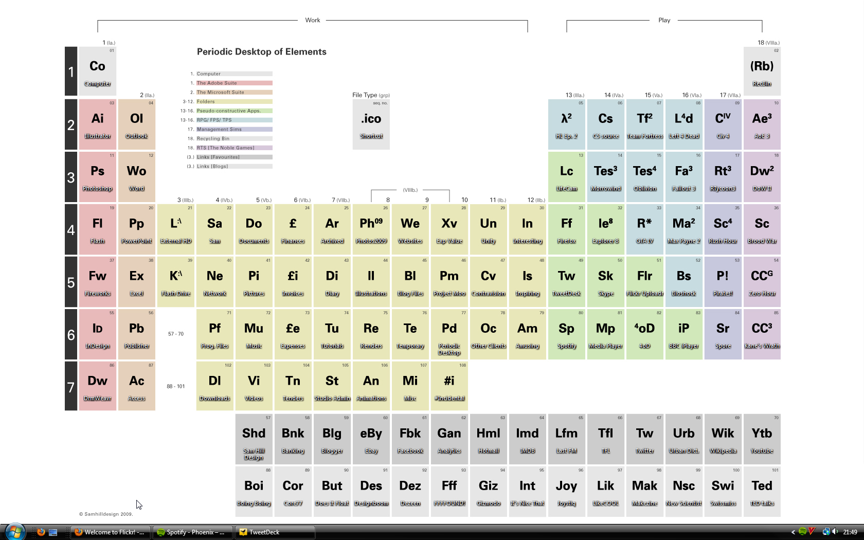
Below is a screenshot of the wallpaper in use. I've created a template for making quick custom icons in Photoshop based upon the Periodic Table 2-3 character standard (this required a "save as...">"_.ico" extension plug-in):

Periodic Desktop of the Elements (in Use)

* Yes, that's right, I'm a designer and I use a PC.

Wednesday, 9 September 2009

Pizza Express - Never Ending Song

Stuart and I recently finished our work on Unity's latest campaign. The client are Pizza Express and the campaign is called The NeverEndingSong. Currently a "NeverEndingSongBus" is carrying jazz musicians from venue to venue across the country as they perform an uninterupted, twenty-four-seven-non-stop-music-marathon. The campaign seeks to raise awareness of the public to contemporary jazz and also Pizza Express' close relationship with the genre.

We helped Unity put the concept together, and also delivered some graphics for it, negotiating with brand stakeholders and such.

Below is the van. Actually, it's one of two. I'll update the photo with one in-situ if I can (ha, unfortunately for me, I'm not in-situ, you see)

NeverEndingSongBus

Thursday, 25 June 2009

Defrost


It’s quite important when designing an icon – an essential class of visual communication – to produce something that is easily and instantly comprehendible. It is necessary to understand and refer to an existing canon of typologies, signs and symbols – acknowledging time is a factor and exploiting a mental shorthand to deliver the message. To achieve this one might draw comparisons or visual simile.

So….presumably when Tesco were designing graphics for their chocolate gateaux, they thought the best way of conveying the message “it is necessary for you to remove this product from the freezer well in advance of eating” was by drawing an analogy between the mildly souring experience of eating a cake not entirely unthawed, and the global crisis of irreversible and disastrous climate change. Good work! I hope they went home early after that brainstorm. Of course, now it makes perfect sense to choose one of the most heart-rending (and overused) images of global warming: a doomed polar bear stranded on a dislodged chunk of it’s dwindling habitat.

At least the bear is smiling. Maybe it’s subliminal. Supermarkets are supposed to be malevolent and unstoppable forces for evil aren’t they? Like Zorg Industries? Perhaps they want us to think of cheap consumer products every time we see a natural disaster on the television. They could use a picture of a wrecked tanker to sell treacle: “directions for use: pour over pancakes in much the same way that this corrosive petrochemical has caked over this turtle breeding ground” or try “4 blade razors – decimate your own Brazilian rainforest”.

If I was ‘in charge’ I would adopt this hilarious symbol below to instruct purchasers to “pre-heat oven to 200 degrees”. Underneath I’d write “(That’s about as hot as a child’s arm on fire)*”:


[*- sorry, that's an outright lie. In an oxygen-rich environment a child's arm would most likely burn at around 1200 - 1500˚C .]

Gun Face

Gun Face (if looks could kill...)

Friday, 29 May 2009

Wednesday, 25 March 2009

Friday, 6 March 2009

Pixel MP5

mp5

I would probably agree that Pixel-Art has had it's day, but there is something very theraputic about blocking in all those colours with the pencil tool.

Sunday, 1 February 2009

Fifteen Second Film Competition

My entry for the an as-yet-unnamed film-making competition with Stuart Bannocks and Kasper Pincis . The two requirements were that the film be 1) themed around the word "Obtuse", 2) No longer than 15 seconds.

Friday, 19 December 2008

La Braderie De L'Art

Stuart, Oli and I were invited to attend Le Braderie De L'Art (as were our good friends Oi Studio & WeMake), a 24-hour straight design-and-make festival in Lille, in the Nord-Pas de Calais region of France.

We systematically disassembled and re-represented found objects. This performance-process was designed to aid the viewer in changing their perceptions towards common, day-to-day "magic-box" electronic and mechanical objects.

Deconstructing, recording and re-organising the components of an archaic Nintendo Entertainment System:

Lille #1

Lille #2

NES Controller (Lille #3)

NES Breakapart (Lille #4)

We also stamped several hundred on-demand badge-postcard objects for visitors to the Braderie, using damaged and abandoned books.

Lille #5

Thursday, 11 December 2008